This project analyzes a dataset of 8,128 used car sales records from CarDekho.com, India’s largest online used car vendor. Spanning vehicles manufactured between 1994 and 2020, the dataset contains both numerical and categorical variables related to car specifications, sales trends, and market performance.
The project employs Exploratory Data Analysis (EDA), advanced feature engineering, and regression modeling to identify key factors affecting car prices and generate actionable insights for used car buyers and sellers.
Data Cleaning and Feature Engineering:
age and maruti for advanced analysis.Exploratory Data Analysis:
Regression Modeling:
Insights:
For detailed analysis, including methodologies, visualizations, and insights, refer to the complete project report:
📄 Used Car Sales Analysis Report
.
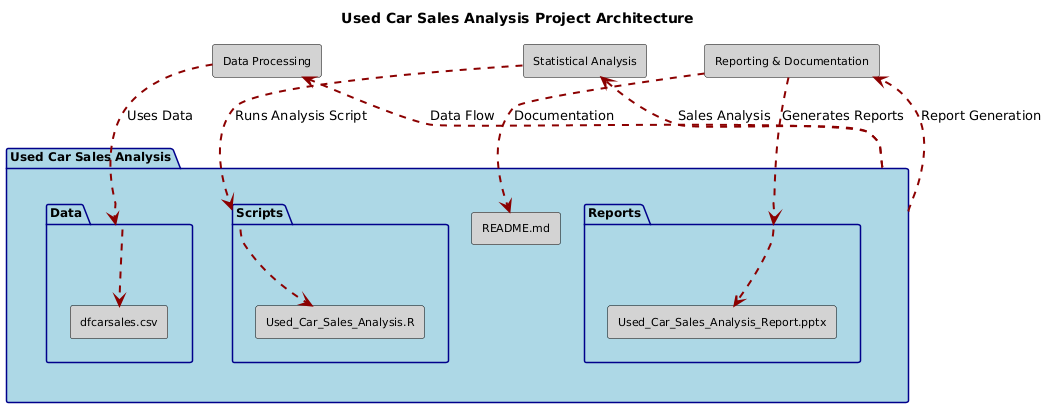
├── Data/
│ ├── dfcarsales.csv
├── Scripts/
│ ├── Used_Car_Sales_Analysis.R
├── Reports/
│ ├── Used_Car_Sales_Analysis_Report.pptx
├── README.md
Feel free to reach out for feedback, questions, or collaboration opportunities:
LinkedIn: Dr. Syed Faizan
Author: Syed Faizan
Master’s Student in Data Analytics and Machine Learning
| #---------------------------------------------------------# | |
| # Syed Faizan # | |
| # Used Car Sales Analysis # | |
| # # | |
| # # | |
| # # | |
| # # | |
| #---------------------------------------------------------# | |
| #Starting with a clean environment | |
| rm(list=ls()) | |
| #Loading the packages utilized for Data cleaning and Data Analysis | |
| library(tidyverse) | |
| library(grid) | |
| library(gridExtra) | |
| library(dplyr) | |
| library(ggplot2) | |
| library(caret) | |
| library(car) | |
| # Clearing the Console | |
| cat("\014") # Clears the console | |
| rm(list = ls()) # Clears the global environment | |
| # Loading the Data set and Outliers removed using outlier analysis | |
| v <- read.csv("dfcarsales.csv") | |
| # Calculate Z-scores for numerical variables to identify outliers | |
| library(dplyr) | |
| numerical_cols <- c('year', 'price', 'km', 'mileage', 'engine', 'seats') | |
| # Box plots for visualization | |
| par(mfrow=c(2, 3)) # Set up the plotting area to display multiple plots | |
| for (col in numerical_cols) { | |
| boxplot(v[[col]], main=paste("Box Plot of", col), horizontal=TRUE) | |
| } | |
| par(mfrow = c(1,1)) | |
| # Outlier removal | |
| v_zscores <- v %>% | |
| select(all_of(numerical_cols)) %>% | |
| mutate(across(everything(), scale)) # Calculating the Z-scores | |
| v_outliers <- v_zscores %>% | |
| mutate(outlier = if_else(rowSums(abs(select(., everything())) > 3) > 0, TRUE, FALSE)) | |
| num_outliers <- sum(v_outliers$outlier) | |
| total_points <- nrow(v) | |
| outlier_percentage <- (num_outliers / total_points) * 100 | |
| # Printing the number of outliers and their percentage | |
| print(paste("Number of outliers:", num_outliers)) | |
| print(paste("Percentage of outliers:", outlier_percentage)) | |
| # Removing outliers from v | |
| v_df2 <- v[!v_outliers$outlier, ] | |
| # Print the dimensions of the cleaned dataframe | |
| print(dim(v_df2)) | |
| summary(v_df2) | |
| # Correlation matrix using {GGally} | |
| library(GGally) | |
| # creating a new categorical column variable | |
| # for analysing 'maruti' and 'non-maruti' cars | |
| v_df <- v %>% | |
| mutate(maruti = as.factor(if_else(model == "Maruti", "maruti", "non_maruti"))) | |
| ggpairs(v, columns = numerical_cols, aes(color = v$maruti, alpha = 0.5)) | |
| # create new 'age' numeric column using 'year' | |
| current_year <- 2024 | |
| # Create 'age' variable | |
| v_df2$age <- current_year - v_df2$year | |
| # Display the first few rows to verify the 'age' variable has been added | |
| head(v_df) | |
| # Four assumptions of Linear Regression checked | |
| # 1. Linearity | |
| # 2. Homoscedasticity | |
| # 3. Independence of variables (presumed for this study as it is cross-sectional) | |
| # 4. Normal distribution of errors of the variables with QQ Plots | |
| # 1. Linear relationship between dependent and independent variables | |
| # examined visually | |
| library(gridExtra) | |
| library(ggplot2) | |
| variables <- c('age', 'km', 'mileage', 'engine', 'seats') | |
| plots <- list() | |
| for (var in variables) { | |
| p <- ggplot(v_df, aes_string(x = var, y = 'price')) + | |
| geom_point(alpha = 0.3) + | |
| ggtitle(paste(var, "vs Price")) | |
| plots[[var]] <- p | |
| } | |
| grid.arrange(grobs = plots, ncol = 3) | |
| # Removing'year' as age column renders it superfluous | |
| v_df$year <- NULL | |
| # Ordinal Encoding of categorical variables for involvement in | |
| # correlation | |
| # Converting trans column into binary: 0 if Manual and 1 if Automatic | |
| v_df$trans <- str_replace(v_df$trans, 'Manual', "0") | |
| v_df$trans <- str_replace(v_df$trans, 'Automatic', "1") | |
| v_df$trans <- as.numeric(v_df$trans) | |
| table(v_df$trans) | |
| # Converting owner into Ordinal Encoder for different categories | |
| v_df$owner <- str_replace(v_df$owner, 'First Owner', "0") | |
| v_df$owner <- str_replace(v_df$owner, 'Second Owner', "1") | |
| v_df$owner <- str_replace(v_df$owner, 'Third Owner', "2") | |
| v_df$owner <- str_replace(v_df$owner, 'Fourth & Above Owner', "3") | |
| v_df$owner <- str_replace(v_df$owner, 'Test Drive Car', "4") | |
| v_df$owner <- as.numeric(v_df$owner) | |
| table(v_df$owner) | |
| # Converting seller into Ordinal Encoder | |
| v_df$seller <- str_replace(v_df$seller, "Trustmark Dealer", "0") | |
| v_df$seller <- str_replace(v_df$seller, "Dealer", "1") | |
| v_df$seller <- str_replace(v_df$seller, "Individual", "2") | |
| v_df$seller <- as.numeric(v_df$seller) | |
| table(v_df$seller) | |
| # Converting fuel into Ordinal Encoder | |
| v_df$fuel <- str_replace(v_df$fuel, 'Diesel', "0") | |
| v_df$fuel <- str_replace(v_df$fuel, 'Petrol', "1") | |
| v_df$fuel <- str_replace(v_df$fuel, 'CNG', "2") | |
| v_df$fuel <- str_replace(v_df$fuel, 'LPG', "3") | |
| v_df$fuel <- as.numeric(v_df$fuel) | |
| table(v_df$fuel) | |
| # converting 'maruti' column using binary encoding | |
| v_df$maruti <- str_replace(v_df$maruti, 'maruti', "1") | |
| v_df$maruti <- str_replace(v_df$maruti, 'non_1', "0") | |
| table(v_df$maruti) | |
| # Log transformation of the price and kilometers driven | |
| library(ggplot2) | |
| library(gridExtra) | |
| # Histogram of price | |
| p1 <- ggplot(data = v_df, aes(x = price)) + | |
| geom_histogram(binwidth = 5000, fill = "skyblue", color = "black") + | |
| labs(title = "Histogram of Price", x = "Price", y = "Count") | |
| # Density plot of price with normal distribution overlay | |
| p2 <- ggplot(data = v_df, aes(x = price)) + | |
| geom_density(fill = "lightgray", alpha = 0.5) + | |
| stat_function(fun = dnorm, args = list(mean = mean(v_df$price, na.rm = TRUE), sd = sd(v_df$price, na.rm = TRUE)), color = "red", linetype = "dashed") + | |
| xlab("Price") + | |
| labs(title = "Density plot of Price with Normal Distribution Overlay") + | |
| scale_fill_manual(values = c("lightgray" = "lightgray")) + | |
| theme_minimal() | |
| # Arrange the plots side by side | |
| gridExtra::grid.arrange(p1, p2, ncol = 2) | |
| library(ggplot2) | |
| # Density plot of log-transformed price with normal distribution overlay | |
| p <- ggplot(data = v_df, aes(x = log(price))) + | |
| geom_density(fill = 'lightgray', alpha = 0.5) + | |
| stat_function(fun = function(x) dnorm(x, mean = mean(log(v_df$price), na.rm = TRUE), sd = sd(log(v_df$price), na.rm = TRUE)), color = 'red', linetype = 'dashed') + | |
| xlab('Log Price') + | |
| labs(title = 'Density Plot of Log Transformed Price') | |
| # Display the plot | |
| print(p) | |
| # Adding log of price column to the data frame | |
| v_df$log_price <- log(v_df$price) | |
| # Histogram of km | |
| p1 <- ggplot(data = v_df, aes(x = km)) + | |
| geom_histogram(binwidth = 5000, fill = "skyblue", color = "black") + | |
| labs(title = "Histogram of Kilometers", x = "Kilometers", y = "Count") | |
| # Density plot of km with normal distribution overlay | |
| p2 <- ggplot(data = v_df, aes(x = km)) + | |
| geom_density(fill = "lightgray", alpha = 0.5) + | |
| stat_function(fun = dnorm, args = list(mean = mean(v_df$km, na.rm = TRUE), sd = sd(v_df$km, na.rm = TRUE)), color = "red", linetype = "dashed") + | |
| xlab("Kilometers") + | |
| labs(title = "Density Plot of Kilometers with Normal Distribution Overlay") + | |
| scale_fill_manual(values = c("lightgray" = "lightgray")) + | |
| theme_minimal() | |
| # Arrange the plots side by side | |
| gridExtra::grid.arrange(p1, p2, ncol = 2) | |
| # Adding log of km column to the data frame | |
| v_df$log_km <- log(v_df$km) | |
| # Density plot of log-transformed km with normal distribution overlay | |
| p3 <- ggplot(data = v_df, aes(x = log_km)) + | |
| geom_density(fill = 'lightgray', alpha = 0.5) + | |
| stat_function(fun = function(x) dnorm(x, mean = mean(v_df$log_km, na.rm = TRUE), sd = sd(v_df$log_km, na.rm = TRUE)), color = 'red', linetype = 'dashed') + | |
| xlab('Log Kilometers') + | |
| labs(title = 'Density Plot of Log Transformed Kilometers') | |
| # Display the density plot of log-transformed km | |
| print(p3) | |
| # Subset numeric columns only | |
| numericv <- v_df[sapply(v_df, is.numeric)] | |
| v_df <- numericv | |
| # drop 'price' and 'km' as their logarithmic transforms have been taken into consideration | |
| v_df$price <- NULL | |
| v_df$km <- NULL | |
| # correlation matrix again on the data frame after feature engineering | |
| library(ggcorrplot) | |
| library(stargazer) | |
| cor_matrix <- cor(v_df, use = "complete.obs") | |
| cor_matrix <- cor(v_df, use = "complete.obs") | |
| stargazer(cor_matrix, type = "text") | |
| ggcorrplot(cor_matrix, lab = TRUE) | |
| # We carry out regression analysis only on the originally numeric variables | |
| # discarding ordinal coding | |
| # Linear Regression to examine relationship between variables using scatterplots | |
| # and regression on Data frame "v_df2" with outliers removed | |
| #simple linear regression between numeric variables | |
| # Scatter plot of variables 'Mileage' and 'Price'. | |
| ggplot(data = v_df2, aes(x = mileage, y = price, color = trans)) + | |
| geom_point() + | |
| labs(title = "Scatter Plot of Cars' Mileage vs Selling Price", x = "Mileage", y = 'Selling Price') + | |
| theme(axis.text.x = element_text(angle = 90, vjust = 0.5, hjust=1, size = 10)) + | |
| geom_smooth(method = "lm") | |
| # Simple Linear Regression 1 | |
| lm(v_df2$price ~ v_df2$mileage) | |
| summary(lm(v_df2$price ~ v_df2$mileage)) | |
| # Scatter plot and Simple Linear Regression between 'engine' and 'price' | |
| ggplot(data = v_df2, aes(x = engine, y = price, color = maruti)) + | |
| geom_point() + | |
| labs(title = "Scatter Plot of Cars' Engine Size vs Selling Price", x = "Engine Size", y = 'Selling Price') + | |
| theme(axis.text.x = element_text(angle = 90, vjust = 0.5, hjust=1, size = 10)) + | |
| geom_smooth(method = "lm") | |
| lm_model <- lm(price ~ engine, data = v_df2) | |
| summary(lm_model) | |
| # Scatter plot and Simple Linear Regression between 'age' and 'price' | |
| ggplot(data = v_df2, aes(x = age, y = price, color = maruti)) + | |
| geom_point() + | |
| labs(title = "Scatter Plot of Cars' Age vs Selling Price", x = "Age", y = 'Selling Price') + | |
| theme(axis.text.x = element_text(angle = 90, vjust = 0.5, hjust=1, size = 10)) + | |
| geom_smooth(method = "lm") | |
| lm_model_age <- lm(price ~ age, data = v_df2) | |
| summary(lm_model_age) | |
| # Scatter plot and Simple Linear Regression between logarithms of 'km' and 'price' | |
| ggplot(data = v_df2, aes(x = log_km, y = log_price, color = trans)) + | |
| geom_point() + | |
| labs(title = "Scatter Plot of Cars' Log(KM) vs Log(Price)", x = "Log(KM)", y = 'Log(Price)') + | |
| theme(axis.text.x = element_text(angle = 90, vjust = 0.5, hjust=1, size = 10)) + | |
| geom_smooth(method = "lm") | |
| lm_model_logs <- lm(log_price ~ log_km, data = v_df2) | |
| summary(lm_model_logs) | |
| # Linear regression model | |
| # Creating a Subset of the numeric variables | |
| numeric_v_df2 <- v_df2 %>% | |
| select(where(is.numeric)) | |
| colnames(numeric_v_df2) | |
| carsales_model <- lm( log_price ~ mileage + engine + seats + log_km + age, data = v_df2) | |
| summary(carsales_model) #summarize the model | |
| library(stargazer) | |
| stargazer(carsales_model, type = "text") # create the table | |
| # Improving the model through automated 'All Subset Regression' analysis | |
| library(leaps) | |
| # removing 'price', 'km' and 'year' from the numeric data set to run | |
| # all subsets regression analysis using the leaps package | |
| # as they have been superceded by log_price , log_km and age. | |
| numericv <- numeric_v_df2 %>% | |
| select( - price, - year, -km) | |
| # leaps package automatically regresses log_price against all | |
| # the other variables in the data set plus all interactions | |
| all_subset_model <- regsubsets(log_price ~ .^2, data = numericv , nbest = 1, method = "exhaustive") | |
| model_summary <- summary(all_subset_model) # view the model | |
| # Adjusted R-squared for each model | |
| adj_r2 <- model_summary$adjr2 | |
| print(adj_r2) | |
| # Identifying the model with the highest | |
| # adjusted R-squared for each subset size | |
| best_by_size <- which.max(adj_r2) | |
| print(best_by_size) | |
| # Details of the best model for each subset size | |
| best_models <- model_summary$which[best_by_size, ] | |
| print(best_models) | |
| # Getting the names of all predictors considered in the model | |
| all_predictors <- colnames(model_summary$which)[-1] # Exclude intercept | |
| # Extracting the best model's details | |
| best_model_details <- model_summary$which[best_by_size, ] | |
| # Filtering to get only the predictors included in the best model | |
| included_predictors <- all_predictors[best_model_details[-1]] # Exclude intercept | |
| # Printing the best model's size and its predictors | |
| cat("Best Model Size:", best_by_size, "") | |
| cat("Predictors in the Best Model:", toString(included_predictors), "") | |
| # The best Multiple Linear Regression Model based on | |
| # all Subset Regression Analysis after outlier removal and feature engineering | |
| All_subset_model_best <- lm(log_price ~ engine + age + mileage:log_km + engine:seats + engine:log_km + engine:age + seats:log_km + seats:age, data = v_df2) | |
| summary(All_subset_model_best) # Summarize and plot the final model | |
| stargazer(All_subset_model_best, type = "text") # Create Table out of final model | |
| plot(All_subset_model_best) # Diagnostic plots of the final model | |
© 2025 Syed Faizan. All Rights Reserved.