This project uses Logistic Regression to classify colleges into Public or Private categories based on the College dataset from the ISLR package. The dataset provides information about U.S. colleges, including tuition fees, student demographics, and graduation rates.
By employing advanced modeling techniques, this project showcases the ability to predict college types accurately, identify significant predictors, and explore the educational sector in depth.
Data Preprocessing:
Logistic Regression Modeling:
Evaluation Metrics:
Business Impact:
Best Predictors:
Model Accuracy:
Confusion Matrix:
For a detailed analysis, including methodology, visualizations, and insights, refer to the complete project report:
📄 College Type Prediction Report
.
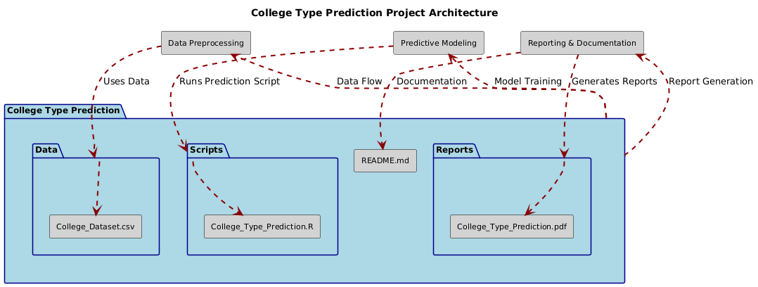
├── Data/
│ ├── College_Dataset.csv
├── Scripts/
│ ├── College_Type_Prediction.R
├── Reports/
│ ├── College_Type_Prediction.pdf
├── README.md
Feel free to reach out for feedback, questions, or collaboration opportunities:
LinkedIn: Dr. Syed Faizan
Author: Syed Faizan
Master’s Student in Data Analytics and Machine Learning
| #---------------------------------------------------------# | |
| # Syed Faizan # | |
| # College Type Prediction # | |
| # # | |
| # # | |
| # # | |
| # # | |
| #---------------------------------------------------------# | |
| # Starting with a clean environment | |
| rm(list=ls()) | |
| # Clearing the Console | |
| cat("\014") # Clears the console | |
| # Removing Scientific Notation | |
| options(scipen = 999) | |
| # Loading the packages utilized for Data cleaning and Data Analysis | |
| library(tidyverse) | |
| library(grid) | |
| library(gridExtra) | |
| library(dplyr) | |
| library(ggplot2) | |
| library(ISLR) | |
| library(caret) | |
| library(vtable) | |
| library(dlookr) | |
| library(DataExplorer) | |
| library(psych) | |
| library(pROC) | |
| library(rms) | |
| # Import the data set and perform Exploratory Data Analysis by | |
| # using descriptive statistics and plots to describe the data set. | |
| cl <- College | |
| # Rough overview of the data set | |
| summary(cl) | |
| names(cl) | |
| View(cl) | |
| # Descriptive statistics table using automated package | |
| st(cl) | |
| # Univariate Analysis | |
| # Histograms of numeric variables | |
| plot_histogram(cl) | |
| # Box plots of numeric variables by College Type | |
| Apps_Private <- cl$Apps[cl$Private == "Yes"] | |
| Apps_Public <- cl$Apps[cl$Private == "No"] | |
| summary(Apps_Public) | |
| boxplot(Apps_Private, Apps_Public, col = "red", | |
| main = "Box Plot of Applications received by College Type (excluding one outlier of 48094 Applications received)", | |
| xlab = " Private vs public College Type", ylim = c(0, 21000)) | |
| # Automating boxp lots by college type using a 'for loop' | |
| numeric_vars <- sapply(cl, is.numeric) | |
| numeric_vars["Private"] <- FALSE # remove 'Private' if it's mistakenly considered numeric | |
| # Iterate over each numeric variable and create a box plot | |
| par(mfrow=c(4, 4)) # Adjust the grid dimensions according to the number of variables | |
| for (var in names(numeric_vars[numeric_vars])) { | |
| Private_Var <- cl[[var]][cl$Private == "Yes"] | |
| Public_Var <- cl[[var]][cl$Private == "No"] | |
| boxplot(Private_Var, Public_Var, col = c("blue", "green"), | |
| main = paste("Box Plot of", var, "by College Type"), | |
| xlab = "College Type", ylab = var, | |
| names = c("Private", "Public")) | |
| } | |
| # Scatterplots | |
| attach(cl) | |
| # scatterplot 1 | |
| qplot(x = Apps, y = Accept, color = Private, shape = Private, geom = 'point') + | |
| scale_color_manual(values = c("red", "blue")) + # Colors for points | |
| scale_shape_manual(values = c(16, 17)) + # ylim to exclude lone outlier of 48094 applications | |
| ylim(c(0, 20000)) + xlim(c(0,23000)) | |
| # scatterplot 2 | |
| qplot(x = F.Undergrad, y = Outstate, color = Private, shape = Private, geom = 'point') + | |
| scale_color_manual(values = c("red", "blue")) + # Colors for points | |
| scale_shape_manual(values = c(16, 17)) | |
| #Scatterplot 3 | |
| qplot(x = perc.alumni, y = Outstate, color = Private, shape = Private, geom = 'point') + | |
| scale_color_manual(values = c("green", "magenta")) + # Colors for points | |
| scale_shape_manual(values = c(16, 17)) | |
| #Scatterplot 4 | |
| qplot(x = Books, y = Room.Board, color = Private, shape = Private, geom = 'point') + | |
| scale_color_manual(values = c("yellow", "purple")) + # Colors for points | |
| scale_shape_manual(values = c(16, 17)) | |
| detach(cl) | |
| #Pair plot of the variables in the data set | |
| pairs(cl) | |
| # Feature Engineering | |
| # Firstly, I am creating two new columns - 1. One for college names from row names and other | |
| # 2. To numerically encode College Types with Public = 0 and Private = 1. | |
| cl$collegebinary <- ifelse(cl$Private == "No", 0, 1) | |
| cl$collegenames <- rownames(cl) | |
| # Verify these changes | |
| head(cl) | |
| # Secondly, I factorize and re-level 'Private' to suit my preferences | |
| # Converting 'Private' to a factor | |
| cl$Private <- factor(cl$Private) | |
| # Set 'No', that is Public colleges, as the reference level | |
| cl$Private <- relevel(cl$Private, ref = "No") | |
| # Verify the changes | |
| str(cl$Private) | |
| # Correlation analysis to identify potential explanatory variables in the glm model. | |
| cl_numeric <- cl[ , c(2:19)] | |
| cor_matrix <- cor(cl_numeric) | |
| print(cor_matrix) | |
| # In order to ensure that the plot is not too busy I choose only those variables with a pearsons correlation | |
| # more than .4 in absolute value. | |
| cl_numeric2 <- cl_numeric[ ,c(1,2,3, 6,7,8,14,15,18)] | |
| cor_matrix2 <- cor(cl_numeric2) | |
| print(cor_matrix2) | |
| plot_correlation(cor_matrix2) | |
| # Visualizing the correlation matrix | |
| library(ggcorrplot) | |
| ggcorrplot(cor_matrix2, method = "square", type = "lower", | |
| lab = TRUE, lab_size = 4, | |
| colors = c("red", "white", "blue"), | |
| title = "Correlation matrix of College Data", | |
| tl.cex = 10) | |
| # Splitting the data into a train and test set. | |
| partition <- createDataPartition(cl$Private, p = 0.7, list = FALSE, times = 1) | |
| # Creating the training data set | |
| cl_train <- cl[partition, ] | |
| # Create the testing data set | |
| cl_test <- cl[-partition, ] | |
| # Examining the two Data sets | |
| summary(cl_train) | |
| summary(cl_test) | |
| # Using the glm() function in the ‘stats’ package | |
| # to fit a logistic regression model to the training set using at least two predictors. | |
| # making sure "Private" is a factor | |
| str(cl_train$Private) | |
| # Fitting a logistic regression model using glm() | |
| logistic_model_glm1 <- glm(Private ~ Apps + Accept + Enroll + F.Undergrad + P.Undergrad + Outstate + S.F.Ratio + perc.alumni, | |
| data = cl_train, family = "binomial") | |
| summary(logistic_model_glm1) | |
| # Removing 'Accept' from the model to create model 2 | |
| logistic_model_glm2 <- glm(Private ~ Apps + Enroll + F.Undergrad + P.Undergrad + Outstate + S.F.Ratio + perc.alumni, | |
| data = cl_train, family = "binomial") | |
| summary(logistic_model_glm2) | |
| # Compare the nested models with a likelihood ratio test | |
| lrt_result1 <- anova(logistic_model_glm2, logistic_model_glm1, test = "Chisq") | |
| # Print the LRT result | |
| print(lrt_result1) # Second model is better | |
| # Further refinement of the model by removing P.Undergrad | |
| logistic_model_glm3 <- glm(Private ~ Apps + Enroll + F.Undergrad + Outstate + S.F.Ratio + perc.alumni, | |
| data = cl_train, family = "binomial") | |
| summary(logistic_model_glm3) | |
| # Comparing the nested models with a likelihood ratio test | |
| lrt_result2 <- anova(logistic_model_glm3, logistic_model_glm2, test = "Chisq") | |
| # Printing the second LRT result | |
| print(lrt_result2) # Third model is better | |
| # Refining lastly by removing S.F.Ratio | |
| logistic_model_glm4 <- glm(Private ~ Apps + Enroll + F.Undergrad + Outstate + perc.alumni, | |
| data = cl_train, family = "binomial") | |
| summary(logistic_model_glm4) | |
| # Comparing the nested models with a likelihood ratio test | |
| lrt_result3 <- anova(logistic_model_glm4, logistic_model_glm3, test = "Chisq") | |
| # Printing the second LRT result | |
| print(lrt_result3) # Fourth model is better | |
| # Using rms package for detailed summary of the final model | |
| lrm_model4 <- lrm(Private ~ Apps + Enroll + F.Undergrad + Outstate + perc.alumni, | |
| data = cl_train, x = TRUE, y = TRUE ) | |
| lrm_model4 | |
| # Creating a confusion matrix and report the results of your model for the train set. | |
| # Interpret and discuss the confusion matrix. | |
| # Load the required package | |
| library(caret) | |
| # Predict probabilities for the training set | |
| predicted_probabilities <- predict(logistic_model_glm4, newdata = cl_train, type = "response") | |
| # Convert probabilities to binary classification using a threshold of 0.5 | |
| predicted_classes <- ifelse(predicted_probabilities > 0.5, "Yes", "No") | |
| # Actual classes | |
| actual_classes <- cl_train$Private | |
| # Create a confusion matrix | |
| confusion_matrix <- table(Predicted = predicted_classes, Actual = actual_classes) | |
| # Print the confusion matrix | |
| print(confusion_matrix) | |
| # Calculate and print confusion matrix metrics using the caret package | |
| confusion_matrix_metrics <- confusionMatrix(confusion_matrix) | |
| print(confusion_matrix_metrics) | |
| # Assignment Question 6. Create a confusion matrix and report the results of your model for the test set. | |
| predicted_probabilities_test <- predict(logistic_model_glm4, newdata = cl_test, type = "response") | |
| predicted_classes_test <- ifelse(predicted_probabilities_test > 0.5, "Yes", "No") | |
| actual_classes_test <- cl_test$Private | |
| confusion_matrix_test <- table(Predicted = predicted_classes_test, Actual = actual_classes_test) | |
| print(confusion_matrix_test) | |
| confusion_matrix_metrics_test <- confusionMatrix(confusion_matrix_test) | |
| print(confusion_matrix_metrics_test) | |
| # Model on the test set | |
| logistic_model_glm4_test <- glm(Private ~ Apps + Enroll + F.Undergrad + Outstate + perc.alumni, | |
| data = cl_test, family = "binomial") | |
| summary(logistic_model_glm4_test) | |
| # Model using rms package | |
| lrm_model4_test <- lrm(Private ~ Apps + Enroll + F.Undergrad + Outstate + perc.alumni, | |
| data = cl_test, x = TRUE, y = TRUE ) | |
| lrm_model4_test | |
| # Assignment Question 7 | |
| # Plot and interpret the ROC curve. | |
| library(pROC) | |
| # ROC curve for the training data | |
| roc_train <- roc(actual_classes, predicted_probabilities) | |
| plot(roc_train, col = "green", main = "ROC for Training Data") | |
| # ROC curve for the testing data | |
| roc_test <- roc(actual_classes_test, predicted_probabilities_test) | |
| plot(roc_test, add = FALSE, col = "red", main = "ROC for Testing Data") | |
| # Assignment Question 8 | |
| # Calculate and interpret the AUC. | |
| # Add AUC to the plot | |
| auc(roc_train) | |
| # Add AUC to the plot | |
| auc(roc_test) | |
| # END OF PROJECT | |


© 2025 Syed Faizan. All Rights Reserved.