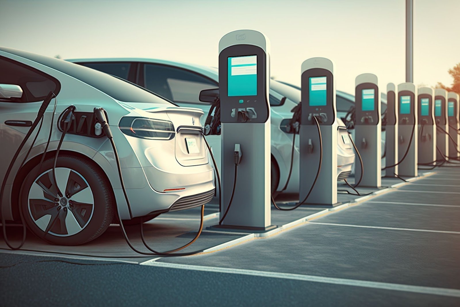
This R Shiny application provides an interactive dashboard for analyzing the adoption of electric vehicles (EVs) across manufacturers, and models. It delves into trends, market comparisons, and the impact of Clean Alternative Fuel Vehicle (CAFV) incentives.
Primary Question: How has the adoption of electric vehicles evolved over time across different geographic regions, manufacturers, and models? What impact have CAFV incentives had on this adoption?
Findings:
Experience the live application here:
🚀 R Shiny Dashboard
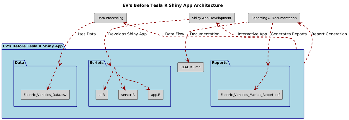
.
├── Data/
│   ├── Electric_Vehicles_Data.csv
├── Scripts/
│   ├── app.R
│   ├── ui.R
│   ├── server.R
├── Reports/
│   ├── Electric_Vehicles_Market_Report.pdf
├── README.md
## 🤝 Connect with Me
Feel free to reach out for feedback, questions, or collaboration opportunities:
LinkedIn: Dr. Syed Faizan
Author: Syed Faizan
Master’s Student in Data Analytics and Machine Learning
| #---------------------------------------------------------# | |
| # Syed Faizan # | |
| # R Shiny Application # | |
| # # | |
| # # | |
| #---------------------------------------------------------# | |
| # Starting with a clean environment---- | |
| rm(list = ls()) | |
| # Clearing the Console | |
| cat("\014") # Clears the console | |
| # Clearing scientific notation | |
| options(scipen = 999) | |
| library(shiny) | |
| library(shinydashboard) | |
| library(ggplot2) | |
| library(dplyr) | |
| library(plotly) | |
| library(DT) | |
| library(shinyjs) | |
| library(rsconnect) | |
| library(shinyWidgets) | |
| library(rpivotTable) | |
| # Load the dataset | |
| ev_data <- read.csv("evfinal.csv") | |
| # Data cleaning | |
| ev_data <- ev_data %>% | |
| mutate(CAFV_Eligibility = as.factor(Clean.Alternative.Fuel.Vehicle..CAFV..Eligibility), | |
| Electric_Vehicle_Type = as.factor(Electric.Vehicle.Type), | |
| Make = as.factor(Make), | |
| Model = as.factor(Model), | |
| Model_Year = as.integer(Model.Year)) | |
| # Define the UI | |
| ui <- dashboardPage( | |
| dashboardHeader(title = "Electric Vehicle Data Dashboard"), | |
| dashboardSidebar( | |
| sidebarMenu( | |
| menuItem("Dashboard", tabName = "dashboard", icon = icon("dashboard")), | |
| menuItem("Data Table", tabName = "data_table", icon = icon("table")), | |
| menuItem("Pivot Table", tabName = "pivot_table", icon = icon("table")), | |
| menuItem("About", tabName = "about", icon = icon("info-circle")), | |
| menuItem("Share", tabName = "share", icon = icon("share-alt")), | |
| menuItem("Visit the Dashboard Webpage", | |
| icon = icon("send", lib = 'glyphicon'), | |
| href = "https://syedfaizan.shinyapps.io/ALY6070_Module5_RShiny_FaizanS/") | |
| ), | |
| sliderInput("yearRange", "Select Model Year Range:", | |
| min = 2008, max = 2020, value = c(2008, 2020), sep = ""), | |
| pickerInput("make", "Select Make:", | |
| choices = c("All", unique(as.character(ev_data$Make))), | |
| options = list(`actions-box` = TRUE, `live-search` = TRUE)), | |
| pickerInput("cafv", "Select CAFV Eligibility:", | |
| choices = c("All", unique(as.character(ev_data$CAFV_Eligibility))), | |
| options = list(`actions-box` = TRUE)), | |
| pickerInput("evType", "Select Electric Vehicle Type:", | |
| choices = c("All", unique(as.character(ev_data$Electric_Vehicle_Type))), | |
| options = list(`actions-box` = TRUE)), | |
| pickerInput("model", "Select Model:", | |
| choices = c("All", unique(as.character(ev_data$Model))), | |
| options = list(`actions-box` = TRUE)) | |
| ), | |
| dashboardBody( | |
| useShinyjs(), # Include shinyjs for social media buttons | |
| fluidRow( | |
| valueBoxOutput("totalVehicles", width = 3), | |
| valueBoxOutput("avgElectricRange", width = 3), | |
| valueBoxOutput("mostCommonMake", width = 3), | |
| valueBoxOutput("mostCommonModel", width = 3) | |
| ), | |
| tabItems( | |
| tabItem(tabName = "dashboard", | |
| fluidRow( | |
| box(title = "Total Vehicles by Model Year", status = "primary", solidHeader = TRUE, collapsible = TRUE, | |
| plotlyOutput("vehiclesByYear")), | |
| box(title = "Base MSRP vs. Electric Range", status = "primary", solidHeader = TRUE, collapsible = TRUE, | |
| plotlyOutput("msrpVsRange")) | |
| ), | |
| fluidRow( | |
| box(title = "Top Vehicles by Make", status = "primary", solidHeader = TRUE, collapsible = TRUE, | |
| plotlyOutput("topVehiclesByMake")), | |
| box(title = "Total Vehicles by CAFV Eligibility", status = "primary", solidHeader = TRUE, collapsible = TRUE, | |
| plotlyOutput("vehiclesByCAFV")) | |
| ), | |
| fluidRow( | |
| box(title = "Average Base Price by Make", status = "primary", solidHeader = TRUE, collapsible = TRUE, | |
| plotlyOutput("basePriceByMake")), | |
| box(title = "Average Electric Range by Make", status = "primary", solidHeader = TRUE, collapsible = TRUE, | |
| plotlyOutput("electricRangeByMake")) | |
| ) | |
| ), | |
| tabItem(tabName = "data_table", | |
| fluidRow( | |
| box(title = "Electric Vehicle Data Table", status = "primary", solidHeader = TRUE, collapsible = TRUE, | |
| DTOutput("dataTable")) | |
| ) | |
| ), | |
| tabItem(tabName = "pivot_table", | |
| fluidRow( | |
| box(title = "Electric Vehicle Pivot Table", status = "primary", solidHeader = TRUE, collapsible = TRUE, | |
| rpivotTableOutput("pivotTable")) | |
| ) | |
| ), | |
| tabItem(tabName = "about", | |
| fluidRow( | |
| box(title = "About this Dashboard", status = "primary", solidHeader = TRUE, collapsible = TRUE, | |
| h3("Electric Vehicle Data Dashboard"), | |
| p("This dashboard provides insights into the adoption and distribution of electric vehicles in the USA. | |
| It includes various visualizations such as total vehicles by model year, geographic distribution, top vehicle manufacturers, | |
| and the impact of CAFV eligibility on vehicle adoption. In this dashboard a variety of visualizations have been employed to | |
| ensure that the data is communicated clearly and effectively to the intended audience. The choice of visualizations, | |
| including line charts, bar charts, and pie charts, reflects the principles of data storytelling and design discussed | |
| in the course. For instance, the line chart depicting the total vehicles by model year provides a clear view of trends over time, | |
| while the bar chart showing average base price by make effectively compares different manufacturers. | |
| The dashboard aims to answer key questions related to the electric vehicle market, such as the distribution of vehicles by type and eligibility for clean air vehicle (CAFV) status. It tells a story about the current state and trends in the electric vehicle industry, offering insights into the most popular models and manufacturers, as well as geographic distribution. Through this assignment, I aim to showcase the ability to create visually appealing and insightful data visualizations that not only inform but also engage the audience, adhering to ethical guidelines to avoid any potential bias or misleading representations.") | |
| ) | |
| ) | |
| ), | |
| tabItem(tabName = "share", | |
| fluidRow( | |
| box(title = "Share this Dashboard", status = "primary", solidHeader = TRUE, collapsible = TRUE, | |
| actionButton("shareTwitter", "Share on Twitter", icon = icon("twitter")), | |
| actionButton("shareInstagram", "Share on Instagram", icon = icon("instagram")), | |
| actionButton("shareLinkedIn", "Share on LinkedIn", icon = icon("linkedin")), | |
| actionButton("shareWeb", "Share on Web", icon = icon("globe")) | |
| ) | |
| ) | |
| ) | |
| ) | |
| ) | |
| ) | |
| # Define the server logic | |
| server <- function(input, output) { | |
| filtered_data <- reactive({ | |
| data <- ev_data %>% | |
| filter(Model_Year >= input$yearRange[1] & Model_Year <= input$yearRange[2]) | |
| if (input$make != "All") { | |
| data <- data %>% filter(Make == input$make) | |
| } | |
| if (input$cafv != "All") { | |
| data <- data %>% filter(CAFV_Eligibility == input$cafv) | |
| } | |
| if (input$evType != "All") { | |
| data <- data %>% filter(Electric_Vehicle_Type == input$evType) | |
| } | |
| if (input$model != "All") { | |
| data <- data %>% filter(Model == input$model) | |
| } | |
| data | |
| }) | |
| output$totalVehicles <- renderValueBox({ | |
| total_vehicles <- nrow(filtered_data()) | |
| valueBox( | |
| formatC(total_vehicles, format = "d", big.mark = ","), | |
| "Total Vehicles", | |
| icon = icon("car"), | |
| color = "purple" | |
| ) | |
| }) | |
| output$avgElectricRange <- renderValueBox({ | |
| avg_range <- mean(filtered_data()$Electric.Range, na.rm = TRUE) | |
| valueBox( | |
| paste0(round(avg_range, 1), " Miles"), | |
| "Avg Electric Range", | |
| icon = icon("bolt"), | |
| color = "orange" | |
| ) | |
| }) | |
| output$mostCommonMake <- renderValueBox({ | |
| most_common_make <- filtered_data() %>% | |
| count(Make) %>% | |
| top_n(1, wt = n) %>% | |
| pull(Make) | |
| valueBox( | |
| most_common_make, | |
| "Most Common Make", | |
| icon = icon("industry"), | |
| color = "blue" | |
| ) | |
| }) | |
| output$mostCommonModel <- renderValueBox({ | |
| most_common_model <- filtered_data() %>% | |
| count(Model) %>% | |
| top_n(1, wt = n) %>% | |
| pull(Model) | |
| valueBox( | |
| most_common_model, | |
| "Most Common Model", | |
| icon = icon("car-side"), | |
| color = "green" | |
| ) | |
| }) | |
| # Total Vehicles by Model Year | |
| output$vehiclesByYear <- renderPlotly({ | |
| p <- ggplot(filtered_data(), aes(x = Model_Year)) + | |
| geom_area(stat = "count", fill = "purple", alpha = 0.7) + | |
| labs(title = "Total Vehicles by Model Year", x = "Model Year", y = "Total Vehicles") + | |
| scale_x_continuous(breaks = seq(2008, 2020, 1), labels = as.character(seq(2008, 2020, 1))) + | |
| theme_minimal() + | |
| theme(axis.text.x = element_text(angle = 45, hjust = 1), | |
| panel.grid.major = element_blank(), | |
| panel.grid.minor = element_blank()) | |
| ggplotly(p) %>% layout(margin = list(b = 100)) | |
| }) | |
| # Base MSRP vs. Electric Range Scatter Plot | |
| output$msrpVsRange <- renderPlotly({ | |
| p <- ggplot(filtered_data(), aes(x = Electric.Range, y = Base.MSRP, color = factor(Model_Year))) + | |
| geom_point(alpha = 0.7) + | |
| labs(title = "Base MSRP vs. Electric Range", x = "Electric Range (miles)", y = "Base MSRP") + | |
| theme_minimal() + | |
| theme(axis.text.x = element_text(angle = 45, hjust = 1), | |
| panel.grid.major = element_blank(), | |
| panel.grid.minor = element_blank()) | |
| ggplotly(p) %>% layout(margin = list(b = 100)) | |
| }) | |
| # Top Vehicles by Make (Dot Plot) | |
| output$topVehiclesByMake <- renderPlotly({ | |
| make_data <- filtered_data() %>% | |
| group_by(Make) %>% | |
| summarise(Total_Vehicles = n()) %>% | |
| arrange(desc(Total_Vehicles)) | |
| p <- ggplot(make_data, aes(x = reorder(Make, Total_Vehicles), y = Total_Vehicles, fill = Make)) + | |
| geom_point(size = 5) + | |
| geom_segment(aes(x = reorder(Make, Total_Vehicles), xend = reorder(Make, Total_Vehicles), y = 0, yend = Total_Vehicles)) + | |
| labs(title = "Top Vehicles by Make", x = "Make", y = "Total Vehicles") + | |
| theme_minimal() + | |
| scale_fill_manual(values = rainbow(n = length(unique(make_data$Make)))) + | |
| theme(axis.text.x = element_text(angle = 45, hjust = 1), | |
| panel.grid.major = element_blank(), | |
| panel.grid.minor = element_blank()) | |
| ggplotly(p) %>% layout(margin = list(b = 100)) | |
| }) | |
| # Total Vehicles by CAFV Eligibility (Pie Chart) | |
| output$vehiclesByCAFV <- renderPlotly({ | |
| cafv_data <- filtered_data() %>% | |
| group_by(CAFV_Eligibility) %>% | |
| summarise(Total_Vehicles = n()) | |
| p <- plot_ly(cafv_data, labels = ~CAFV_Eligibility, values = ~Total_Vehicles, type = 'pie', hole = 0.4, | |
| marker = list(colors = c("yellow", "orange"))) %>% | |
| layout(title = "Total Vehicles by CAFV Eligibility", | |
| xaxis = list(showgrid = FALSE, zeroline = FALSE, showticklabels = FALSE), | |
| yaxis = list(showgrid = FALSE, zeroline = FALSE, showticklabels = FALSE)) | |
| p | |
| }) | |
| # Average Base Price by Make (Bar Chart) | |
| output$basePriceByMake <- renderPlotly({ | |
| price_data <- filtered_data() %>% | |
| group_by(Make) %>% | |
| summarise(Average_Base_MSRP = mean(Base.MSRP, na.rm = TRUE)) | |
| p <- ggplot(price_data, aes(x = Make, y = Average_Base_MSRP, fill = Make)) + | |
| geom_bar(stat = "identity") + | |
| labs(title = "Average Base Price by Make", x = "Make", y = "Average Base MSRP") + | |
| theme_minimal() + | |
| scale_fill_manual(values = rainbow(n = length(unique(price_data$Make)))) + | |
| theme(axis.text.x = element_text(angle = 45, hjust = 1), | |
| panel.grid.major = element_blank(), | |
| panel.grid.minor = element_blank()) | |
| ggplotly(p) %>% layout(margin = list(b = 100)) | |
| }) | |
| # Average Electric Range by Make | |
| output$electricRangeByMake <- renderPlotly({ | |
| range_data <- filtered_data() %>% | |
| group_by(Make) %>% | |
| summarise(Average_Range = mean(Electric.Range, na.rm = TRUE)) | |
| p <- ggplot(range_data, aes(x = Make, y = Average_Range, fill = Make)) + | |
| geom_bar(stat = "identity") + | |
| labs(title = "Average Electric Range by Make", x = "Make", y = "Average Electric Range (miles)") + | |
| theme_minimal() + | |
| scale_fill_manual(values = rainbow(n = length(unique(range_data$Make)))) + | |
| theme(axis.text.x = element_text(angle = 45, hjust = 1), | |
| panel.grid.major = element_blank(), | |
| panel.grid.minor = element_blank()) | |
| ggplotly(p) %>% layout(margin = list(b = 100)) | |
| }) | |
| # Data Table | |
| output$dataTable <- renderDT({ | |
| datatable(filtered_data(), options = list(pageLength = 10, scrollX = TRUE)) | |
| }) | |
| # Pivot Table | |
| output$pivotTable <- renderRpivotTable({ | |
| rpivotTable(filtered_data()) | |
| }) | |
| # Social Media Share Buttons | |
| observeEvent(input$shareTwitter, { | |
| shinyjs::runjs('window.open("https://twitter.com/intent/tweet?text=Check out this awesome Electric Vehicle Data Dashboard!&url=http://yourdashboardurl.com", "_blank")') | |
| }) | |
| observeEvent(input$shareInstagram, { | |
| shinyjs::runjs('window.open("https://www.instagram.com/sharer.php?u=http://yourdashboardurl.com", "_blank")') | |
| }) | |
| observeEvent(input$shareWeb, { | |
| shinyjs::runjs('window.open("http://yourdashboardurl.com", "_blank")') | |
| }) | |
| observeEvent(input$shareLinkedIn, { | |
| shinyjs::runjs('window.open("https://www.linkedin.com/shareArticle?mini=true&url=http://yourdashboardurl.com", "_blank")') | |
| }) | |
| } | |
| # Run the application | |
| shinyApp(ui, server) |
© 2025 Syed Faizan. All Rights Reserved.